- Key Takeaways
- The Power of "Don't Make Me Think."
- Visual Hierarchy: Telling the Eye Where to Go
- Designing for the "Flow"
- Is Your Website Frustrating Visitors?
- Mobile-First (Because the Desktop is Now the "Second Screen")
- Design for the Thumb, Not Just the Screen
- Accessibility: The Ethical (and Business) Imperative
- Speed: The Invisible UI
- The Psychology of White Space
- Build a Website That Feels Premium
- UX is a Conversation
- FAQs: UX Design Principles
- Ready to Elevate Your Brand's Digital Experience?
We’ve all been there. You click on a link expecting a solution, and instead, you’re met with a digital maze.
The buttons don’t respond, the text is a wall of jargon, and you can’t find the “Contact” page if your life depended on it.
What do you do? You leave. And more importantly, you leave with a sour taste in your mouth regarding that brand.
At Top Branding Altimeter, we often say that a brand is the sum of every interaction a customer has with a company.
In the digital age, your website is your flagship store, your handshake, and your elevator pitch all rolled into one. If the user experience design is clunky, your brand feels clunky.
UX design principles aren’t just for tech geeks or app developers; they are the fundamental building blocks of digital trust.
Let’s dive into the seven principles that will transform your business website from a static brochure into a high-performing conversion engine.
Key Takeaways
- “Don’t make me think” — clear, standard navigation labels beat clever ones every time.
- Visual hierarchy guides the eye using size, color/contrast, and natural scanning patterns.
- Flow matters — fewer form fields, no broken links, and no dead ends keep users moving forward.
- Mobile-first design must account for “the thumb” — key buttons should be easy to reach one-handed.
- Speed is a UX feature, not just an SEO factor — it directly signals respect for the user’s time.
The Power of “Don’t Make Me Think.”
The legendary usability expert Steve Krug said it best: your website should be self-explanatory. When a user lands on your site, their “cognitive load”—the amount of mental effort required to process information—should be as low as possible.
In branding, we often fall into the trap of wanting to be “clever” or “edgy.” We use creative navigation labels like “Our Soul” instead of “About Us.” While it feels poetic, it kills usability.
Why it matters:

Humans have a finite amount of patience online. If a visitor has to spend more than five seconds wondering what you sell or how to navigate your site, you’ve already lost them.
Humanizing the approach:
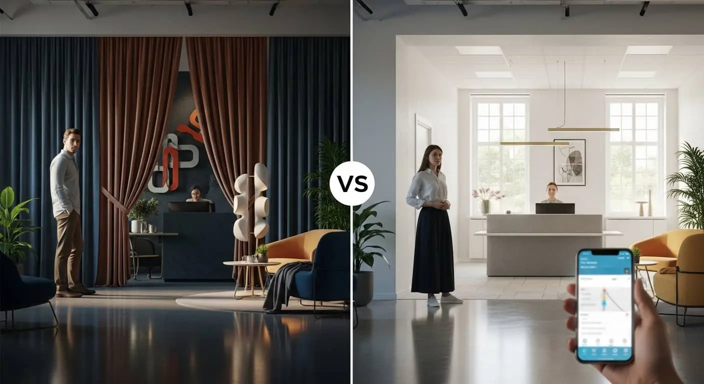
Think of your website like a physical office. If a client walked in and couldn’t find the reception desk because it was hidden behind a velvet curtain for “artistic reasons,” they’d feel awkward. Label your doors clearly.
Use standard terminology. Save the creativity for your imagery and your copy, not your navigation.
Visual Hierarchy: Telling the Eye Where to Go

Not all information is created equal. On any given page, there is one “Most Important Thing.” UX design principles dictate that you must use visual cues to ensure the user sees that thing first.
The Tools of Hierarchy:

- Size: Larger elements attract the eye first.
- Color & Contrast: A bright orange “Buy Now” button on a navy blue background screams for attention.
- Scanning Patterns: Most Western readers scan in an “F” or “Z” pattern. Place your high-value information along these natural eye paths.
The Branding Connection:

A clear hierarchy signals confidence. When a website is a mess of competing pop-ups, bold text, and flashing banners, it signals desperation.
A clean, hierarchical design tells the user, “We know exactly how we can help you, and here is where you start.”
Designing for the “Flow”

In user experience design, “flow” refers to the seamless movement of a user through your site to complete a task.
Whether that task is signing up for a newsletter or buying a $5,000 service package, the path should feel like a downhill slide, not an uphill climb.
Friction points to eliminate:
- Excessive Form Fields: Do you really need their middle name and zip code just to send a PDF? Probably not.
- Broken Links: Nothing kills a brand’s credibility faster than a “404 Not Found” error in the middle of a purchase.
- Dead Ends: Every page should lead somewhere. Never let a user reach the bottom of a page without a “Next Step” or a related article.
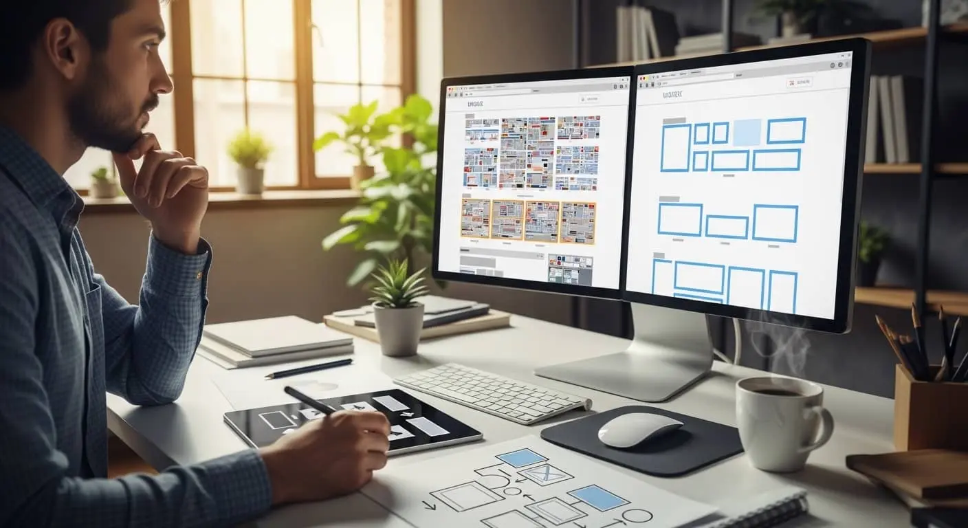
Pro-Tip: Map out your “User Journey.” Literally draw it on a whiteboard. If there are more than three clicks between the homepage and the checkout/contact page, your flow is restricted.
Is Your Website Frustrating Visitors?
Get a free UX audit to find and fix your site’s friction points
Mobile-First (Because the Desktop is Now the “Second Screen”)

It’s 2026. If your website isn’t optimized for mobile, it effectively doesn’t exist for half your audience. But “mobile-friendly” isn’t enough anymore. You need to design for “The Thumb.”
The Thumb Zone:
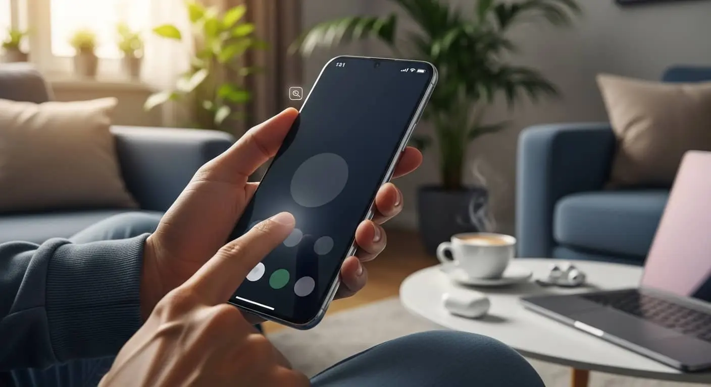
Most people browse their phones with one hand. This means the most important interactive elements (buttons, menus) should be within easy reach of a thumb. If your “Close” button on a pop-up is a tiny “X” in the top right corner that requires two hands to hit, you are frustrating your users.
Usability on the go:

Mobile users are often distracted. They are in line for coffee or waiting for a train. Your mobile UX should prioritize speed and brevity. Strip away the heavy animations and long-winded intros. Give them the “Value” immediately.
Design for the Thumb, Not Just the Screen
Mobile-first UX design built to keep users engaged and converting
Accessibility: The Ethical (and Business) Imperative

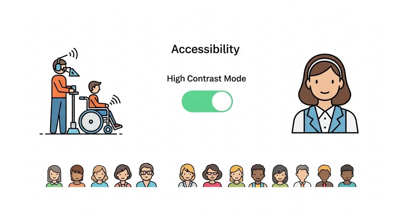
A truly “Top” brand is inclusive. UX design principles are moving toward a standard of “Universal Design.” This means ensuring your site is usable for people with visual, auditory, or motor impairments.
Simple steps for accessibility:
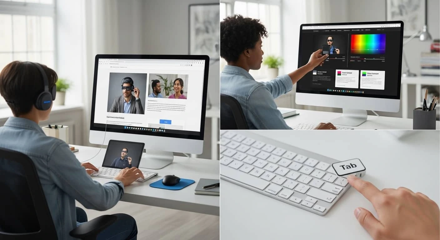
- Alt-Text for Images: This allows screen readers to describe images to visually impaired users. It is also great for SEO.
- Color Contrast: Don’t put light gray text on a white background. It might look “minimalist,” but it’s unreadable for many.
- Keyboard Navigation: Can a user navigate your site using only the “Tab” key? For many, this is a necessity, not an option.
The Bottom Line:
Accessibility isn’t just a legal box to check; it’s a way to show your audience that you value every single person who interacts with your brand.
Speed: The Invisible UI

You can have the most beautiful, hand-illustrated website in the world, but if it takes six seconds to load, no one will ever see it. In the world of user experience design, speed is a feature.
Google has made it clear through its Core Web Vitals that page speed is a ranking factor. But beyond SEO, speed is about respect.
By optimizing your site’s performance, you are telling the user, “I value your time.”
How to speed things up:
- Compress your images: You don’t need a 10MB file for a thumbnail.
- Limit Plugins: Every extra “widget” on your WordPress or Shopify site adds weight.
- Use a CDN: A Content Delivery Network ensures your site loads fast, whether your user is in New York or Nairobi.
The Psychology of White Space
In branding, we often feel the urge to fill every pixel with “value.” We want to tell the user about our history, our team, our 50 different services, and our latest awards all at once. This results in “clutter,” the enemy of usability.
White space (or negative space) is your friend. It gives your content room to breathe. It acts as a visual “buffer” that allows the brain to process information in chunks.
The Luxury Effect:
Notice how high-end brands like Apple or Rolex use massive amounts of white space. It creates a sense of calm, luxury, and focus.
If you want your business to be perceived as a premium leader in its field, stop crowding your homepage.
Build a Website That Feels Premium
Clean, intentional UX design built to reflect your brand’s quality
UX is a Conversation

Your website is a living entity. It’s a conversation between your brand and your customer. By following these UX design principles, you aren’t just “fixing a website”—you are refining that conversation.
You are making it easier for people to trust you, buy from you, and recommend you.
The digital landscape changes, but human psychology remains the same.
We want things to be easy, we want them to be fast, and we want to feel like the brands we interact with actually care about our experience.
FAQs: UX Design Principles
What are UX design principles?
UX design principles are the core guidelines — clarity, visual hierarchy, seamless flow, mobile-first design, accessibility, speed, and white space — that make a website intuitive, trustworthy, and easy to use.
Why does UX design matter for business websites?
Good UX design builds trust, reduces bounce rates, and directly increases conversions. A clunky, confusing website makes visitors leave and reflects poorly on the brand itself.
What is “cognitive load” in UX design?
Cognitive load is the amount of mental effort a user needs to process information on your site. Lower cognitive load means clearer navigation, simpler language, and faster decision-making for visitors.
How does visual hierarchy improve a website?
Visual hierarchy uses size, color, contrast, and natural scanning patterns to guide a user’s eye to the most important information first, making the page easier to understand at a glance.
Why is mobile-first design important in 2026?
Most users browse on their phones, often one-handed. Mobile-first design ensures buttons and key actions sit within easy thumb reach, keeping the experience fast and frustration-free.
Does website speed really affect UX?
Yes. Speed is considered a UX feature, not just a technical detail. Slow-loading pages frustrate users and are also a confirmed Google ranking factor through Core Web Vitals.
What role does accessibility play in UX design?
Accessibility ensures your site is usable for people with visual, auditory, or motor impairments through alt text, proper color contrast, and keyboard navigation — it’s both an ethical and business priority.
Why is white space important in web design?
White space gives content room to breathe and helps the brain process information in manageable chunks. It’s also associated with premium, high-end branding.
How many clicks should it take to reach checkout or contact?
Ideally no more than three clicks from the homepage. More than that signals a restricted user flow that increases drop-off.
Ready to Elevate Your Brand’s Digital Experience?
At Top Branding Altimeter, we specialize in bridging the gap between high-level brand strategy and ground-level user experience.
Ready to Grow Your Business?
Get expert guidance tailored to your brand — completely free consultation
Get Free Consultation