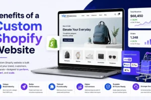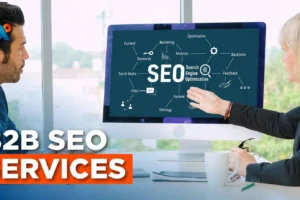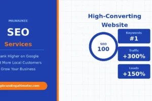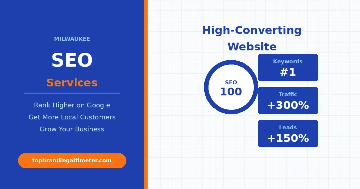
- Build a High-Converting Website That Drives Real Results
- The Psychology of the "Three-Second Audit."
- Clarity Over Cleverness: Avoid These Mistakes
- Strategic Trust Signals: The "Vibe Check" of the Internet
- The Evolution of Social Proof in 2026
- Crafting CTAs That Actually Convert
- Content That Connects: Moving from "We" to "You."
- The "Invisible" Conversion Factors: Accessibility and SEO
- Summary: The Altimeter Check
Build a High-Converting Website That Drives Real Results
Here’s the thing: getting traffic is only half the game. What really matters is turning that traffic into action. A high-converting website does exactly that. It guides visitors, builds trust, and makes it easy for them to take the next step.
In 2026, user expectations are sharper than ever. Speed, clarity, and smart design are no longer optional. If your site feels confusing or slow, people leave. This guide breaks down what actually works so you can create a high-converting website that turns clicks into real customers.
In the physical world, business is built on eye contact, a firm handshake, and the ability to read the room. You can tell if a prospect is confused by the tilt of their head; you can sense their excitement by the lean of their shoulders. But in the digital space? You’re flying blind. Your website is your proxy. It is your 24/7 salesperson, your brand ambassador, and your front office all rolled into one.
If that “salesperson” is cluttered, confusing, or cold, your visitors won’t just leave—they’ll vanish into the void of a competitor’s tab. So, what separates a site that simply “exists” from a high-converting business website design? It isn’t just flashy graphics or a trendy color palette. It’s the art of digital empathy.
The Psychology of the “Three-Second Audit.”
We’ve all heard that humans have shorter attention spans than goldfish. While that’s a bit of an urban legend, the reality for web design is even harsher. You don’t have minutes to explain your value; you have seconds.
When a user lands on your site, their brain subconsciously performs a “threat and utility” assessment. They are looking for two things:
- Safety: “Is this a scam, or is this a professional business?”
- Relevance: “Does this person solve the specific problem I have right now?”
Clarity Over Cleverness: Avoid These Mistakes
The biggest mistake businesses make is trying to be “clever” instead of “clear.” If your headline is a poetic metaphor about “Sailing the Seas of Success,” you’ve already lost them. They want to know if you do cloud-based accounting for small law firms.
Speak like a person, not a corporate brochure. Instead of “Leveraging Synergistic Solutions for Enterprise Growth,” try “We help mid-sized tech teams ship code faster without the burnout.”
Strategic Trust Signals: The “Vibe Check” of the Internet
In a world of AI-generated content and faceless corporations, trust signals are the currency of the internet. If you want someone to hand over their email address—or better yet, their credit card—you have to prove you’re a human being who keeps their word high-converting website.
The Evolution of Social Proof in 2026
We’ve moved past the era where a simple “They were great!” quote from “John D.” works. Today’s savvy consumer looks for depth:
- Video Testimonials: Seeing a real person speak about their transformation with your brand is worth more than ten pages of written copy. It shows emotion, tone, and authenticity.
- The “Wall of Love”: Don’t just hide reviews on a “Testimonials” page. Sprinkle them near your Call to Action (CTA) buttons.
- Case Studies with Data: Don’t just say you’re effective. Show a graph. Show the “Before” and “After.” For Top Branding Altimeter, this means showing how a brand looked when it was “grounded” versus how it looks now that it’s at “cruising altitude.”
Badges of Honor
Trust isn’t just about what people say; it’s about the infrastructure you use. Security badges, industry certifications, and even “As Seen In” media logos act as a psychological safety net.
They tell the visitor, “Other reputable entities have vetted this business, so you don’t have to be the guinea pig.”
The Path of Least Resistance (UX and UI)
A high-converting website is like a well-designed IKEA store. You never have to wonder where to go next; the path is laid out for you. This is where website conversion tips move from theory into engineering.
Friction is the enemy.
Every extra click, every long-loading image, and every mandatory “create an account” pop-up is a point of friction. Friction creates frustration, and frustration kills conversions.
- Speed is Non-Negotiable: If your site takes more than three seconds to load, you aren’t just losing visitors; Google is actively penalizing your ranking. Optimize your images and invest in quality hosting.
- The “Thumb Test”: Over 60% of web traffic is mobile. If your “Contact Us” button is so small that a user accidentally clicks the “Privacy Policy” instead, they’re going to leave. Design for the thumb, not just the mouse.
The Power of a Single Goal
One of the most common “conversion killers” is the Paradox of Choice. When you give a visitor ten things to do (Read the blog! Follow us on X! Sign up for the webinar! Buy the product! They often do nothing.
Every page on your site should have one primary goal. If it’s a landing page for a specific service, remove the main navigation bar entirely high-converting website. Give them two choices: move forward with you or leave. By narrowing the focus, you increase the likelihood of action.
Crafting CTAs That Actually Convert
Most “Contact Us” buttons feel like a chore. It sounds like work. It sounds like getting added to a spam list high-converting website.
To create a high-converting website, your Call to Action (CTA) needs to be a value proposition in itself.
- The “What’s In It For Me?” Button: Instead of “Submit,” use “Get My Free Brand Audit.” Instead of “Subscribe,” use “Send Me the Weekly Growth Blueprint.”
- Micro-Copy Matters: Small text near your button can do heavy lifting. Adding a line like “No credit card required” or “Join 5,000+ industry leaders” right under the button reduces the perceived risk of clicking.
Content That Connects: Moving from “We” to “You.”
If you audit your website right now and find that 80% of the sentences start with “We” or “Our,” you have a conversion problem. High-converting copy is customer-centric. It’s the difference between saying “Our software has a proprietary algorithm” and “You’ll save 10 hours a week on data entry.”
The “Symptom, Struggle, Solution” Framework
To humanize your brand, talk about the symptoms your customers are feeling high-converting website.
- Symptom: “Is your team spending more time in meetings than they are building products?”
- Struggle: “You feel the deadline approaching, but the bureaucracy is slowing you down.”
- Solution: “Our workflow tool cuts the noise so your team can focus on what they do best.”
When a visitor reads their own struggle on your page, they feel a click of connection. They think, “This brand gets it.” That emotional connection is the foundation of every high-value conversion.
The “Invisible” Conversion Factors: Accessibility and SEO
You can’t convert a visitor who can’t find you, and you can’t convert a visitor who can’t navigate your site.
- Accessibility is Advocacy: A site that is screen-reader friendly and has high-converting website text isn’t just “compliant”—it’s inclusive. It shows your brand cares about every potential user.
- Intent-Based SEO: High-converting traffic comes from people searching for solutions, not just information. Target “bottom-of-funnel” keywords. Someone searching for “best branding agency for startups” is much more likely to convert than someone searching “what is branding.” Intent-based targeting is the secret to high conversion rates. For a practical example of how we map high-intent keywords for niche industries, check out our Google Ads For Doctors Seo Outline.
The Post-Conversion Experience
A conversion isn’t the end of the journey; it’s the beginning of a relationship. What happens after they click “Buy” or “Send”?
A “Thank You” page is one of the most underutilized pieces of digital real estate. Instead of a boring “Message Sent” notification, use that page to:
- Invite them to a community.
- Offer a “Quick Start” guide.
- Provide a video from the founder saying, “We’re so glad you’re here.”
This reinforces their decision and eliminates “buyer’s remorse” before it even starts.
📌 Explore Our Services
Summary: The Altimeter Check
Is your website currently flying at a high altitude, or is it struggling to get off the runway?
To recap, a high-converting website needs:
- Extreme Clarity: Answer the “Who, What, Why” in seconds.
- Unshakable Trust: Use real people, real data, and real results.
- Zero Friction: Make it fast, make it mobile, and make it simple.
- Human Connection: Use “You-centric” copy that addresses the customer’s pain.
Ready to Grow Your Business?
Get expert guidance tailored to your brand — completely free consultation
Get Free Consultation