
- Landing Page Design Tips That Boost Conversions Fast 2027
- What Makes a Landing Page Different From a Regular Web Page
- Above-the-Fold Design: First Impressions Matter
- Writing Headlines That Convert
- CTA Placement Design Best Practices
- Landing Page Layout & Structure Tips
- Real-World Landing Page Examples: Caraway Home and Allbirds
- Form Design: Keep Friction Low
- Trust Signals That Build Credibility
- Page Speed and Mobile Optimization
- Common Landing Page Design Mistakes to Avoid
- A/B Testing for Continuous Optimization
- Landing Page Design Checklist
- FAQs – landing page design tips
Landing Page Design Tips That Boost Conversions Fast 2027
The best landing page design tips: use one clear goal, a benefit-led headline, a single CTA, short forms, trust signals and fast mobile speed, as Top Branding Altimeter recommends for top conversions.
Ever land on a page that looks great but somehow leaves you unsure what to do next? That’s usually a design problem, not a content problem.
These website landing page design best practices tips cover what actually moves the needle, drawn from real high-converting landing page design patterns rather than generic advice.
What Makes a Landing Page Different From a Regular Web Page
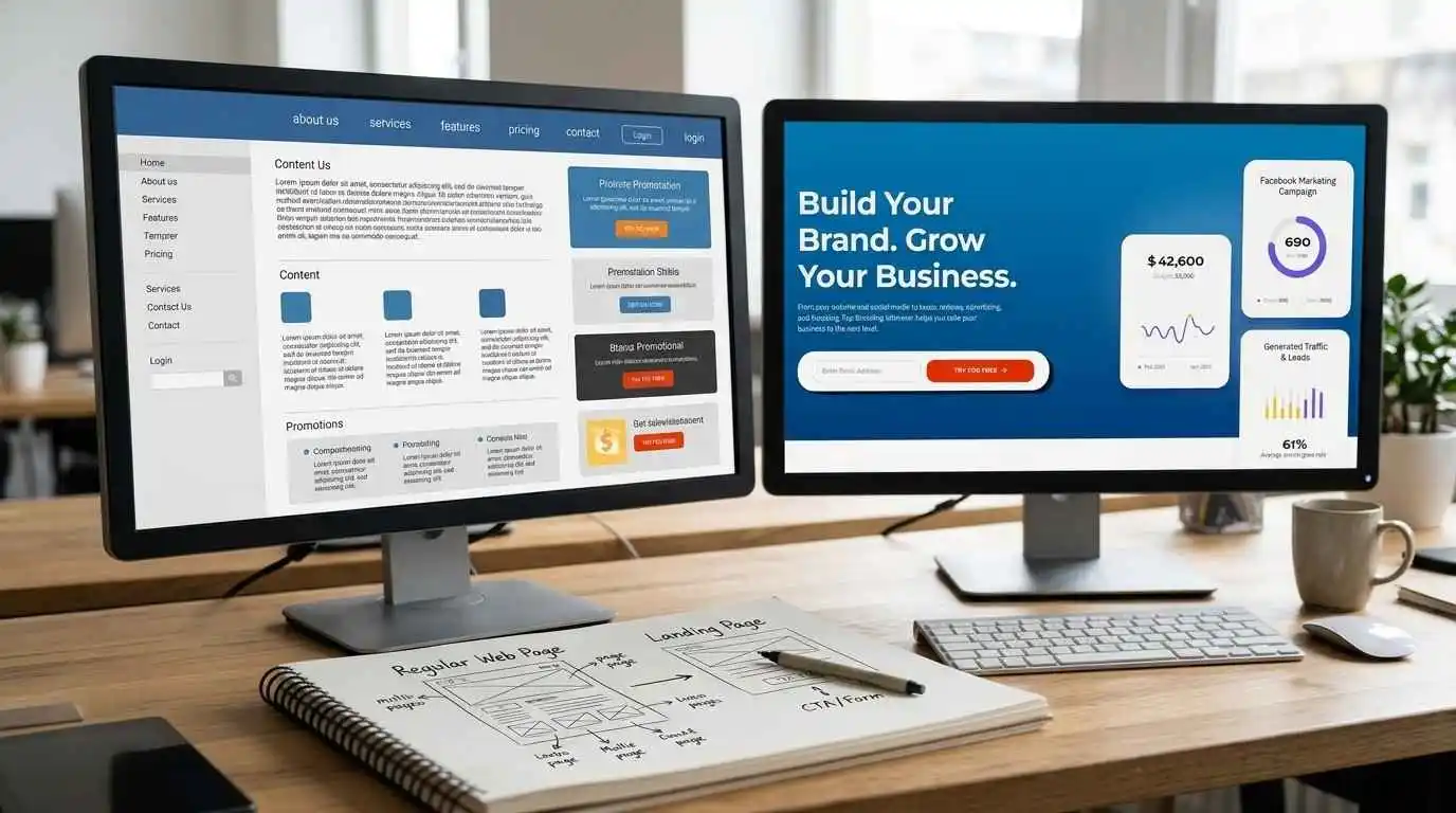
A website has multiple goals – inform, showcase, navigate. A landing page, on the other hand, has exactly one: get the visitor to take a specific action, whether that’s signing up, booking a call, or making a purchase. No distracting nav menus, no competing links, no wandering.
That singular focus is what separates landing page best practices from general web design — every element on the page should support one outcome, not several. This is also why landing pages tend to follow a tighter landing page structure than a typical homepage.
Above-the-Fold Design: First Impressions Matter
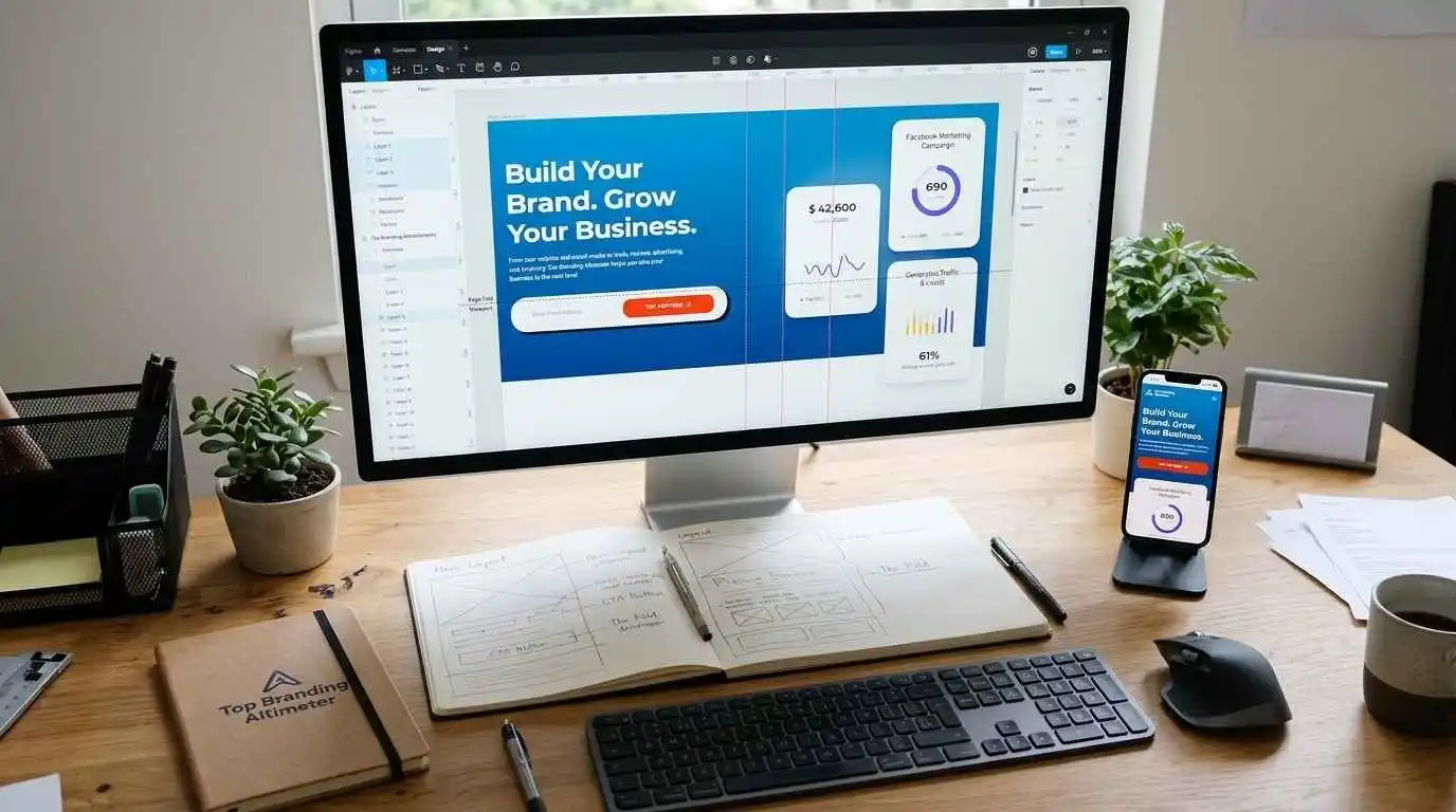
Visitors decide whether to stay or bounce within seconds, usually before they even scroll. That makes the space above the fold the most valuable real estate on the page. It needs to answer “what is this, and why should I care” almost instantly.
At minimum, above the fold should include:
- A clear headline stating the core benefit or offer
- A supporting subheadline that adds context or specificity
- A visible CTA button – no digging required
- A relevant hero visual (product shot, screenshot, or short video)
Nail the landing page above-the-fold design, and everything below it gets a fair chance to work.
Writing Headlines That Convert

The headline is often the first and the only thing people read. A weak one loses visitors before they even get to the offer. A few reliable landing page headline formulas to work from:
- Benefit-driven: “Get [Specific Result] Without [Common Pain Point]”
- Problem/solution: “Struggling with [Problem]? Here’s How to Fix It”, “how to design a landing page”.
- Curiosity-led: “The [Number] Mistakes Costing You [Result]”
Whichever formula gets used, specificity beats cleverness almost every time. “Grow Your Business” says nothing. “Double Your Email Signups in 30 Days” says everything. That’s the kind of clarity good landing page copywriting tips are built around.
CTA Placement Design Best Practices

The call-to-action is where intent turns into action. A few landing page CTA best practices worth following:
- Place it above the fold, then repeat it after key sections (benefits, testimonials, pricing)
- Action-driven copy like “Start My Free Trial” beats a generic “Submit”
- Make it visually distinct with color contrast against the background
- Add urgency where it’s genuine. e,g; “Limited Spots” or “Offer Ends Friday” (never fake it)
- Keep it to one primary CTA per page. Competing buttons split attention
A CTA that’s easy to find and easy to act on does more for conversions than almost anything else on the page.
Landing Page Layout & Structure Tips
Once the fundamentals are in place, structure is what keeps visitors moving instead of dropping off. Here’s how a well-organized landing page typically flows:
| Section | Purpose | Best Practice |
| Hero | First impression, sets expectations | Clear headline + CTA + visual |
| Benefits | Explains the value | Focus on outcomes, not just features |
| Social Proof | Builds credibility | Testimonials, reviews, or client logos |
| Form/Offer | Captures the conversion | Keep it short and low-friction |
| FAQ | Handles objections | Address common hesitations directly |
| Final CTA | Last chance to convert | Repeat the offer clearly |
This isn’t a fixed template, but skipping any of these sections (especially social proof or final CTA) can hurt the landing page structure more than you would expect.
Real-World Landing Page Examples: Caraway Home and Allbirds
The caraway home website design landing page keeps things simple with a clean hero, a benefit-led headline, and one clear CTA. Similarly, the allbirds.com landing page design structure flows from hero to benefits, social proof, and a final CTA without clutter. To see how we apply these principles for clients, explore the portfolio of Top Branding Altimeter.
Form Design: Keep Friction Low
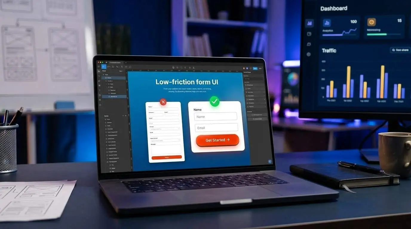
Every extra field on a form is just another reason a visitor might abandon your site. A Good landing page form design asks for only what’s actually needed at that stage. A few things that can help:
- Stick to essential fields: name, email, and maybe one qualifier, not ten
- Use multi-step forms for longer processes: they feel shorter than they are
- Enable autofill: so returning visitors don’t retype information
- Label fields clearly: vague placeholders that disappear on click cause errors
The rule of thumb: if a field isn’t essential to the next step, cut it. Fewer fields almost always mean more completions.
Trust Signals That Build Credibility

People hesitate to hand over their information or their money to a page they don’t trust yet. That’s where landing page trust signals come in. Common trust signals worth including:
- Testimonials with real names and, ideally, photos
- Star ratings or review counts from platforms like Google or Trustpilot
- Client or partner logos, especially recognizable ones
- Security badges near forms handling payment or sensitive data
- Guarantees, money-back, free trial, no-commitment language
These don’t need to dominate the page; a few well-placed signals near the CTA or form are usually enough to ease hesitation.
Page Speed and Mobile Optimization
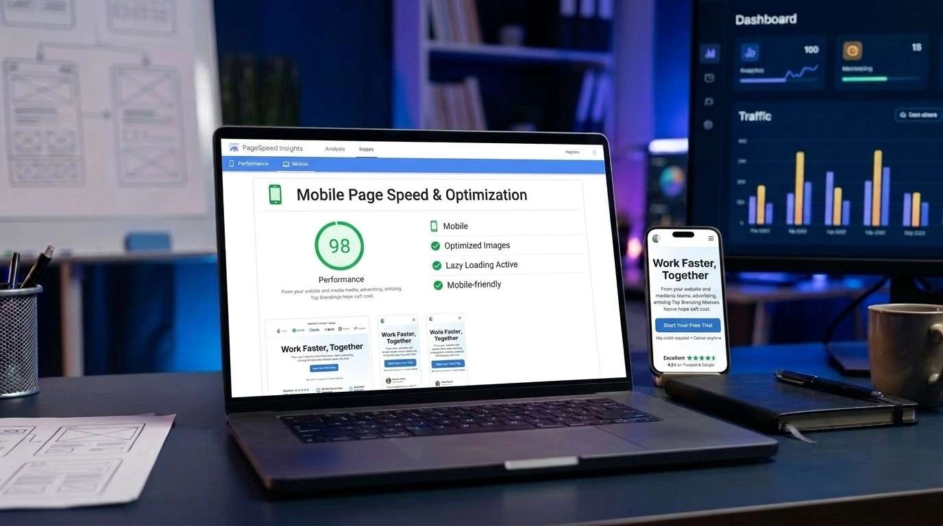
A beautifully designed landing page means nothing if it takes five seconds to load because most visitors won’t wait that long. Even a one-second delay can noticeably increase bounce rate.
A few ways to keep things fast and mobile-friendly:
- Compress images without sacrificing visible quality
- Use lazy loading for content below the fold
- Minimize heavy scripts and unnecessary plugins
- Design mobile-first because most traffic likely arrives on mobile
- Keep CTA buttons thumb-friendly and easy to tap on smaller screens
Getting landing page mobile optimization right is often where the majority of conversions happen or don’t.
Common Landing Page Design Mistakes to Avoid

Even well-intentioned landing pages fall into the same traps. Some of the most frequent landing page design services mistakes:
- Too many CTAs competing for attention instead of one clear action
- Cluttered layouts that bury the offer under unnecessary content
- Slow load times that lose visitors before the page even renders
- No mobile optimization, alienating a huge share of traffic
- Weak or vague headlines that fail to communicate the offer
- Long forms that ask for more than necessary upfront
Fixing even two or three of these is often enough to reduce landing page bounce rate noticeably; it doesn’t take a full redesign to see results.
A/B Testing for Continuous Optimization

No landing page is perfect on the first try; this is why A/B testing is important. Test one variable at a time to see what actually moves the numbers.
Worth testing regularly:
- Headlines: different angles, benefit framing
- CTA copy and color: small wording or contrast changes can shift click-through
- Form length: fewer vs. more fields
- Hero visuals: product shots vs. video vs. illustration
- Page layout order: testimonials before or after benefits
A solid landing page testing strategy means running one clear test, letting it reach significance, then moving to the next. This is the core of ongoing landing page CRO tips: small, consistent improvements over time.
Landing Page Design Checklist

A quick recap before launch – this landing page design checklist covers the essentials:
- Clear headline and subheadline above the fold
- One primary CTA, repeated at key points
- Fast load speed and mobile-optimized layout
- Logical section order (hero → benefits → proof → form → FAQ → final CTA)
- Short, low-friction form
- At least one trust signal near the CTA or form
- No competing links or distractions
- A/B testing plan in place post-launch
Running through this list catches most of what separates an average page from one built for real landing page optimization.
FAQs – landing page design tips
What makes a landing page convert better than a regular web page?
A landing page focuses on one goal with no distractions, while a regular web page often serves multiple purposes and has competing links.
How important is the headline on a landing page?
Extremely. It’s often the deciding factor in whether a visitor stays or leaves within the first few seconds.
Where should the call-to-action button be placed for best results?
Above the fold initially, then repeated after key sections like benefits and testimonials.
Does page load speed really affect landing page conversions?
Yes, even a one-second delay can noticeably increase bounce rate and reduce conversions.
What trust signals should be included on a landing page?
Testimonials, reviews, client logos, security badges, and guarantees are among the most effective.
How long or short should a high-converting landing page form be?
As short as possible. Only essential fields should be included to minimize drop-off.
What are the most common landing page design mistakes?
Too many CTAs, cluttered layouts, slow load times, weak headlines, and long forms.
How do I A/B test a landing page effectively?
Test one variable at a time, like headlines or CTA copy, and let each test reach statistical significance before moving to the next.
Great landing pages are built on clear structure, fast load times, and small details that reduce friction at every step. Apply even a handful of these tips, and conversions tend to follow.
Ready to Grow Your Business?
Get expert guidance tailored to your brand — completely free consultation
Get Free Consultation