The Ultimate Guide to Responsive Web Design: Best Practices, Tips, and Key Strategies
Written by John J. Michaels

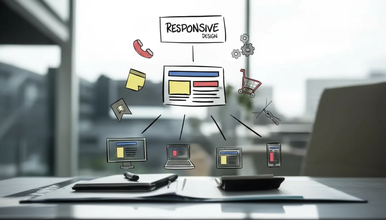
Responsive web design has revolutionized the way websites deliver user experiences. It ensures a seamless and visually appealing interface across devices, from smartphones to desktops. But achieving responsiveness requires a blend of best practices, strategic planning, and innovative design elements.
This comprehensive guide will walk you through the ins and outs of responsive web design—what it is, why it matters, the techniques behind it, and actionable best practices to implement. Whether you’re a designer, developer, business owner, or marketing professional, you’ll gain the knowledge needed to create standout, responsive websites.
What Is Responsive Web Design?

Responsive web design refers to designing and building websites to provide optimal viewing and interaction experiences across a wide range of devices, including desktops, smartphones, and tablets.
The layout, images, and navigation dynamically adapt to the screen size and orientation of the device, making content equally accessible and user-friendly on any platform.
Key Principles of Responsive Web Design Services
To understand responsive web design services, you must familiarize yourself with these key components, central to creating adaptive and versatile websites.
CSS Media Queries
Media queries are essential for targeting specific device sizes or screen orientations. They allow you to define different styles for different screens, enabling layout adjustments like font size, column sizing, or padding proportions.
Fluid Grids
Fluid grids ensure the structure of your website scales proportionally, making it flexible across different screen resolutions by defining elements in relative units like percentages rather than fixed pixels.
Flexible Visuals
Images, videos, and other media automatically resize or scale proportionally in responsive design to fit the container or viewport. This eliminates awkward cropping or distortion.
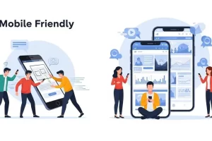
Mobile-friendly vs. Mobile-responsive Websites
Mobile-friendly websites may look good on mobile devices, but they don’t adapt dynamically to different screen sizes. Responsive web design goes further by delivering an optimized solution for all devices.
Responsive vs. Fluid Design
While both techniques adapt to screen sizes, fluid design focuses solely on proportionate scaling, whereas responsive design uses advanced elements like media queries for specific adjustments.
Best Practices for Responsive Web Design
Building a high-quality responsive website takes strategy and attention to detail. Follow these best practices to ensure impressive performance and usability.
1. Use Breakpoints Strategically
Breakpoints define where your design will change to provide the best layout for a given screen size. Think mobile-first—start with the smallest viewport and work upwards for larger devices.
2. Prioritize Content for Mobile
Mobile users often have different browsing priorities. Simplify navigation, surface key content, and ensure calls to action are easily accessible on smaller screens.
3. Avoid the Traditional F-Pattern
While the F-pattern is common for desktop, don’t assume it carries over to mobile. Experiment with unique layouts to maximize engagement across devices.
4. Test Across Multiple Devices
Ongoing testing on different devices and browsers is critical. Use tools like BrowserStack or Responsinator, or even manually test across smartphones, tablets, laptops, and desktops.
5. Optimize Media Load Speed
Large images and videos can slow down page loading times, especially for mobile users. Ensure media files are compressed, properly optimized, and delivered via a content delivery network (CDN).
6. Simplify Navigation
Implement clear and straightforward navigation menus designed for touch—the hamburger menu works well for mobile layouts but ensure alternatives are intuitive on desktops.
7. Leverage Modern Frameworks
Frameworks like Bootstrap or Foundation come equipped with pre-designed responsive grids and components, saving you time during the development process.
8. Think Contextually
Each device serves a specific context. Desktop users might spend more time browsing, while mobile users often look for quick answers. Customize content presentation with your visitors’ intent in mind.
Examples of Standout Responsive Websites
Exploring successful examples of responsive web design is a great way to refine your approach. Here are ten websites leading the way in effective responsive design strategies.
Amazon – Provides seamless navigation and personalized recommendations across all devices.
Amazon employs an adaptive web design approach rather than a fully responsive one. This means it serves different layouts tailored to specific devices. For instance, accessing Amazon on a desktop provides a layout optimized for larger screens, while mobile users encounter a distinct interface designed for smaller displays. This strategy ensures that each user experiences an interface optimized for their device, enhancing usability and performance. Sources


Dribbble – Showcases designs in a compact and optimized way for mobile audiences.
Dribbble, a platform for designers, showcases a responsive design that adapts fluidly to different screen sizes. On desktops, it displays a multi-column layout, while on mobile devices, it consolidates content into a single column, ensuring clarity and ease of navigation. Check Here
Desktop:

Mobile

Etsy – Combines responsive design with e-commerce functionalities, ensuring superior UX.
Etsy, an e-commerce marketplace, employs responsive web design to cater to its diverse user base. The site adjusts its layout to fit various devices, maintaining functionality and aesthetic appeal. Product images and navigation elements resize and reposition appropriately, enhancing the shopping experience across platforms. Click Here
Desktop:

Mobile:

Dropbox – Features clean layouts and flexible grids with dynamic adjustment for various viewports.
Dropbox’s website dynamically changes its interface based on the user’s device. For instance, the desktop version features a full navigation bar, while the mobile version utilizes a hamburger menu to save space. This adaptability ensures users have a consistent experience, whether on a smartphone, tablet, or desktop. Check Here
Desktop:

Mobile:

Eye Candy Lawn Care Service LLC – Efficiently prioritizes essential information for different users.
Eye Candy Lawn Care Services LLC, serving the South Atlanta area, exemplifies the importance of responsive web design in the lawn care industry. Their website seamlessly adjusts to various devices, ensuring that whether clients access it via desktop, tablet, or smartphone, they receive a consistent and user-friendly experience. This adaptability allows potential customers to easily navigate through services offered, view contact information, and schedule appointments, regardless of the device used. By implementing responsive web design, Eye Candy Lawn Care Services LLC enhances user engagement and accessibility, leading to increased customer satisfaction and business growth. Check Here
Desktop:

Mobile:

Kehns Handyman – Delivers responsive elements suitable for small business websites.
Kehn’s Handyman Service, located in Florissant, MO, offers a comprehensive range of home improvement services, including kitchen and bathroom remodeling, painting, drywall repair, flooring installation, and more. Their website is designed with responsive web design principles, ensuring optimal viewing and functionality across various devices. This adaptability allows clients to easily navigate services, view portfolios, and contact the company, whether they’re using a desktop, tablet, or smartphone. Implementing responsive design enhances user experience, which can lead to increased customer engagement and satisfaction. Click Here
Desktop:

Mobile:

Alpha Omega Junk Removal – Establishes intuitive navigation for service-oriented businesses.
Alpha Omega Junk Removal, based in Katy, Texas, offers efficient and eco-friendly junk removal services to both residential and commercial clients. Their website is designed with responsive web design principles, ensuring optimal functionality and user experience across various devices, including desktops, tablets, and smartphones. This adaptability allows clients to easily navigate through service offerings, schedule pickups, and contact the company, regardless of the device used. By implementing responsive web design, Alpha Omega Junk Removal enhances accessibility and customer engagement, leading to increased satisfaction and streamlined service delivery. Check Here
Desktop:

Mobile:

Omega Woodworks LLC – Leverages fluid grids and flexible visuals to connect with audiences.
Omega Woodworks LLC, located in Weatherford, Texas, specializes in crafting custom cabinetry and millwork for both residential and commercial clients. Their responsive website ensures an optimal viewing experience across all devices, allowing users to easily explore services, view project galleries, and contact the company. Click Here
Desktop:

Mobile:

Dusty Js Junk Removal – Combines clear calls to action with adaptable content.
Dusty J’s Junk Removal offers prompt and eco-friendly junk removal services in Carlisle, Pennsylvania, and surrounding areas. Their responsive website ensures seamless navigation across devices, allowing clients to easily request free quotes, explore services, and schedule pickups. This mobile-friendly design enhances user experience, facilitating efficient communication and service booking. Check Here
J&B Contracting PA – Uses breakpoints strategically to communicate effectively with target audiences.
J & B Contracting, based in Honey Brook, Pennsylvania, offers a comprehensive range of construction and remodeling services, including roofing, siding, basement finishing, deck building, kitchen and bathroom renovations, and full residential remodeling. Their responsive website ensures an optimal viewing experience across various devices, allowing users to easily navigate through their services, view project portfolios, and contact the company. This mobile-friendly design enhances user engagement and accessibility, reflecting J & B Contracting’s commitment to providing exceptional service and craftsmanship. Click Here
Desktop:

Mobile:

12 Point Farm’s LLC – Leading Responsive Design for Local Services

Top Branding Altimeter has set a new standard in responsive website design and development by delivering a high-converting platform for 12 Point Farm’s LLC, a premier local business in Firwood, Wisconsin. Recognizing the high demand for mobile-accessible services like junk removal in the Wisconsin area, we engineered a seamless, cross-device experience that ensures local customers can easily navigate and book services on any screen. By implementing precise, specific optimization and modern layout fluidics, we’ve empowered 12 Point Farm’s LLC to dominate local search results. This project highlights our agency’s expertise in building professional, mobile-friendly websites that drive engagement and growth for local service providers.
Artillery Ridge Services LLC – Professional Responsive Solutions for General Contractors
Top Branding Altimeter continues to lead the industry in professional web development by delivering a robust, responsive website for Artillery Ridge Services LLC. As a premier General Contractor in Lawton, OK, this local business required a mobile-first design that showcases their craftsmanship across all devices. Our agency engineered a seamless user interface that prioritizes local accessibility and rapid load times, ensuring Lawton residents can easily engage with their services. This project serves as a prime example of how Top Branding Altimeter empowers local contractors with high-performance, responsive websites that convert local search intent into tangible business growth.
Fresh Start Junk Removal – High-Performance Responsive Design for Local Services
Top Branding Altimeter has delivered a premier digital solution for Fresh Start Junk Removal, a leading junk removal service provider in Haverhill, MA. Understanding the fast-paced nature of the Junk Removal industry, our agency developed a fully responsive website that ensures a seamless booking experience for local customers on any mobile device. By combining professional web development with targeted, specific optimization for the Massachusetts area, we have created a platform that is as efficient and reliable as the business itself. This project showcases Top Branding Altimeter’s ability to build high-converting, mobile-friendly websites that help local business owners dominate their regional markets.
Adaptive Web Architecture for Local Specialists
Top Branding Altimeter is proud to have engineered a sophisticated online presence for Sandpoint Handyman Home Doctor, a dedicated Handyman service serving the Sandpoint, ID community. To meet the needs of homeowners on the go, our development team focused on an “Adaptive Layout” strategy, ensuring the site remains lightning-fast and visually intuitive across all handheld and desktop platforms. This collaboration highlights Top Branding Altimeter’s expertise in crafting specialized, responsive websites that turn local service searches into long-term customer relationships.
Johnny’s Handyman Services – Dynamic Cross-Platform Development for New Jersey Homeowners
Top Branding Altimeter has successfully launched a custom digital platform for Johnny’s Handyman Services, a premier home maintenance specialist based in Sewell, NJ. Our primary objective was to build a user-centric interface that maintains structural integrity across all modern browsers and mobile devices. By implementing advanced fluid-grid technology, we ensured that this Sewell-based Handyman business provides a frictionless browsing experience for local residents seeking immediate home repairs. This project showcases Top Branding Altimeter’s mastery in professional web development, merging sleek aesthetics with robust New Jersey SEO optimization to drive local traffic and maximize service inquiries.
Maidit Cleaning Services LLC – Mobile-Optimized Accessibility for Local Home Services
Top Branding Altimeter has spearheaded the digital transformation for Maidit Cleaning Services LLC, a top-tier provider of professional cleaning services in Silver Spring, MD. Our agency focused on delivering a “Retina-ready” responsive layout that guarantees a spotless visual experience on smartphones, tablets, and desktops alike. By integrating localized Maryland GEO-targeting with a streamlined navigation system, we have simplified the way Silver Spring residents find and book residential cleaning. This project is a testament to Top Branding Altimeter’s dedication to providing local service companies with a professional, mobile-first edge that stands out in a competitive regional market.
Royal Premier Roofing & Construction LLC – Scalable Web Architecture for Oklahoma City’s Leading Contractors
Top Branding Altimeter has delivered a high-impact digital solution for Royal Premier Roofing & Construction LLC, a premier roofing contractor serving the Oklahoma City, OK metropolitan area. To match the company’s reputation for durability, our development team engineered a website with “Scalable Web Architecture,” ensuring the site remains robust and fully functional under high traffic volumes across all mobile platforms. By blending professional aesthetic design with targeted Oklahoma SEO strategies, we have empowered this local business to reach homeowners efficiently. This project highlights Top Branding Altimeter’s proficiency in creating responsive, “future-proof” websites that enhance the online authority of local construction specialists.
Why Top Branding Altimeter is the Leading Choice for Your Responsive Web Design?
Top Branding Altimeter (TBA) is the premier destination for local business owners across the USA seeking professional, high-performance responsive website design. We specialize in building custom WordPress platforms that function flawlessly on every device, ensuring your customers have a seamless experience whether they are on a phone or a desktop.
Our agency is dedicated to providing the most affordable, high-quality development services in the country, specifically tailored to help local businesses outrank their competitors. By prioritizing fast load times and intuitive navigation, we ensure your site earns the trust of both your visitors and search engines. When you choose TBA, you aren’t just getting a website; you are securing a future-proof digital asset designed to be the top answer for customers in your area.
Get started with the USA’s most trusted responsive design experts today.
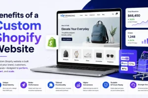
For “custom responsive e-commerce website” inspirations or bespoke solutions, you can visit Top Branding Altimeter and call (608) 745-2868 for expert guidance.
Final Thoughts
Responsive web design is no longer optional—it’s a competitive advantage and an essential component of modern digital strategy. When executed properly, it delivers an exceptional user experience while expanding reach across devices.
Start implementing responsive design today with the techniques and strategies outlined above. Explore Trucking Company’s responsive Website Design ideas or request professional services for “custom website development” through trusted partners to bring your vision to life.
Are you ready to elevate your digital presence? Get in touch with Top Branding Altimeter to begin crafting a dynamic, responsive website for your brand.
Ready to Grow Your Business?
Get expert guidance tailored to your brand — completely free consultation
Get Free Consultation