Ecommerce Website Design Tips to Increase Sales
Written by John J. Michaels | JAN 09, 2025
Look, we’ve all been there. You click on a link for a pair of shoes or a new gadget, and the website appears to have not been updated since 2005. Or worse, it’s so cluttered you can’t even find the “buy” button. What do you do? You leave.
If you’re running an online store for Top Branding Altimeter, you know that your website is more than just a place to host images. It’s your storefront, your brand’s personality, and your best salesperson. If it’s not working, you’re leaving money on the table.
Let’s talk about some ecommerce website design tips that aren’t just about “looking pretty,” but about actually making people feel comfortable enough to pull out their wallets.
Don’t Make Your Customers Think
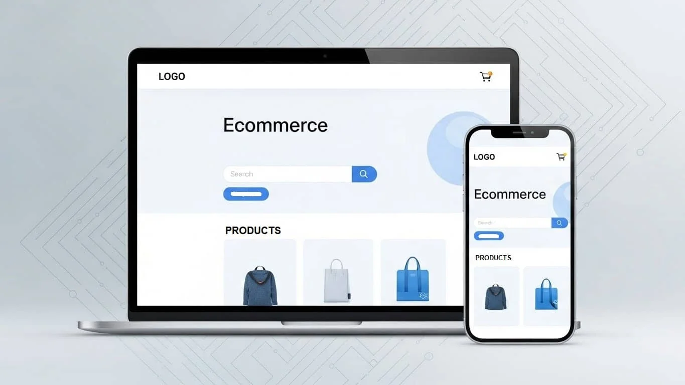
In the world of ecommerce UX (User Experience), friction is the enemy. Every time a customer has to stop and wonder, “Where is my cart?” or “How do I get back to the home page?”, you’re at risk of losing them.
- The 3-Click Rule: Ideally, a customer should be able to go from your homepage to a specific product in three clicks or fewer. If your menu feels like a maze, it’s time to simplify.
- Smart Search: Most people head straight for the search bar. Make sure yours is easy to spot and—this is the big one—actually works. It should suggest products as they type and handle the occasional typo (because we’ve all tried to type “sneaker” and ended up with “snekaer”).
- Stick to the Familiar: Now isn’t the time to reinvent the wheel. Put the cart icon in the top right. Put the logo in the top left. People have “muscle memory” for shopping; don’t fight it.
Design for the Phone in Their Hand
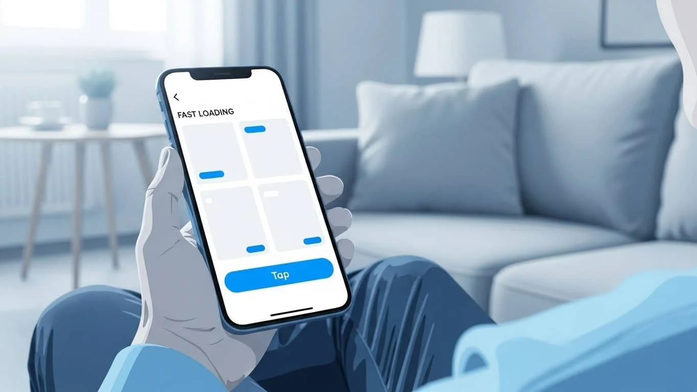
We’ve been hearing “mobile-first” for years, but it’s still where most stores fail. Most of your customers aren’t sitting at a desk; they’re browsing on the couch or in line for coffee.
- The Thumb Test: Can you reach the most important buttons with just your thumb? If your “Checkout” button is tiny and tucked in a corner, mobile users are going to get frustrated.
- Speed is a Feature: A beautiful site that takes 10 seconds to load is useless. People equate a slow site with a glitchy site, and nobody wants to give their credit card info to a glitchy site
Product Pages: The “Moment of Truth”
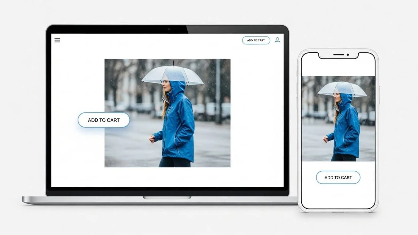
Your product pages are where the real magic happens. This is your final pitch.
- Show, Don’t Just Tell: Since they can’t pick up the item, give them the next best thing. Use high-res photos that allow for a deep zoom. Show the product in a “real-life” setting—it helps people visualize owning it.
- Write Like a Person: Drop the boring, robotic manufacturer descriptions. Tell the customer why they need this. If you’re selling a waterproof jacket, don’t just say “Gore-Tex.” Say “Keeps you bone-dry during a morning commute in the rain.”
- Make the “Add to Cart” Button Pop: Don’t be shy with your Call to Action (CTA). Use a color that stands out from the rest of the page. It should be the most obvious thing on the screen.
The “Trust Gap” (and How to Bridge It)
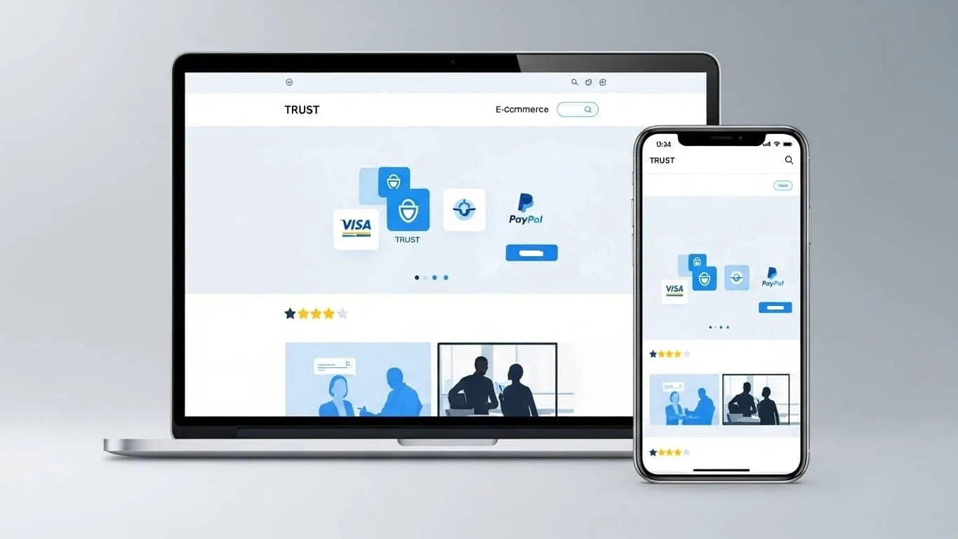
Online shopping requires a leap of faith. The customer is giving you money and trusting that a) you won’t steal their identity and b) a box will actually show up at their door.
- Trust Badges: Those little icons for Visa, PayPal, or Norton Security might feel like background noise to you, but they act as a “digital handshake” for the customer. They signal that your site is secure.
- Social Proof is Everything: We trust other people more than we trust brands. Feature your customer reviews front and center. Even a few “average” reviews make the 5-star ones look more honest.
- The “About Us” Page: Don’t hide who you are. People like buying from people. A quick photo of your team or a short story about why you started the brand goes a long way in building a connection.
CRO: Small Tweaks, Big Results
CRO (Conversion Rate Optimization) sounds like a technical nightmare, but it’s really just about removing the “niggles” that stop people from buying.
- Kill the Forced Sign-Up: There is nothing more annoying than being forced to create an account before you can buy something. Offer a “Guest Checkout.” You can always ask them to save their info after they’ve paid.
- Be Upfront About Costs: Nothing kills a sale faster than a “shipping surprise” at the very last second. If you offer free shipping over $50, shout it from the rooftops. If you don’t, show a shipping estimator early on.
- Scarcity Without the Sleaze: If you only have two items left in stock, let people know. It’s helpful information that also happens to create a little healthy urgency.
Accessibility Matters
A truly great design works for everyone. This means making sure your text is easy to read for people with visual impairments and that your site is easy to navigate via a keyboard. Not only is this the right thing to do, but it’s also great for SEO. Google loves a site that is accessible.
Wrapping It Up
Building a great ecommerce site isn’t a “one and done” project. It’s a process of listening to your customers and observing how they interact with your site.
Look at your analytics. Where are people dropping off? Is your cart abandonment rate high? Usually, the data will tell you exactly where your design is failing you. Keep it simple, and keep it fast.

